Since 2007, when construction began on the Red building at the Pacific Design Center in West Hollywood, the building has been the subject of a stream of questions and speculation.
When will it be finished? Who will occupy it? When will they move in? And why has it been sitting vacant for so long?
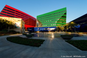
Developed by Charles Cohen, the owner of the PDC and designed by Cesar Pelli, the architect of both the Blue and Green buildings, the Red completes a campus of three primary-colored buildings on the corner of San Vicente Boulevard and Melrose that was conceived in the 1970s.
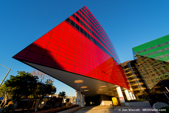
Pelli squeezed the Red into a sliver of land between the Green building, adjacent to the MTA depot lot and the Los Angeles County Sheriff’s Department station. Ship-like, it extends one pointed prow toward San Vicente Boulevard and another point to the residential neighborhoods behind it on Huntley Drive. Red then curves around the north side of the PDC to create what Pelli calls a “loose but not complete embrace.”
In 2006, with images of the design in hand, Los Angeles Times architecture critic Christopher Hawthorne was mostly dismissive of the Red building’s architecture. Claiming “It won’t prompt a reassessment of Pelli’s work. Nor will it radically change how we look at the existing Design Center.”
At that time Hawthorne did not have the advantage of touring the actual building. Recently I did, and a reassessment definitely is in order.
Red is the newest sibling of the “Blue Whale,” the original 1975 building at the PDC and among my favorites. It is a giant blue block of contradictions: while big, audacious and loud, it manages to also be corporate, kind of neighborly, almost artsy and perpetually controversial. The Red has been a slow-rising hulk, loitering in the background of the city. It was supposed to open in 2010, but, as Cohen explained to me in a recent interview, it encountered many difficulties during construction.
The zoning and approval process for Red began in 1998 when Cohen purchased the Pacific Design Center from Catellus Development Corporation, but it wasn’t until 2004, when the Green building was fully occupied, that work on Red really got into gear. The design was revealed to the press in 2006 with a $100 million price tag.
It turned out that a 2010 opening was an overly ambitious goal. First, there were excavation issues. During the first years of construction, heavy rains inundated the site, which already had a high water table, causing the foundation to often fill with water.
But water wasn’t the only underground problem. The builders expected to find two uncharted oil wells, but two became three, three became five, and five became seven wells. Each required removal and decontamination of the soils surrounding them, a lengthy and expensive process (See my piece on the oil field these wells once tapped here.)
These delays not only set the project back two years and counting, but ballooned the cost of Big Red, which is up to $165 million. The same price Cohen paid for both the Blue and Green buildings in 1998.
Cohen’s comments provided a sense of the construction process — laborious and full of surprises — but what of the rumors involving tenants?
The Red building will add 400,000 square feet of office space to the PDC, but filling that space could prove difficult. Early last year the LA Business Journal reported that Cohen has had trouble leasing the space because of both his high asking price, which is at the top end of the Los Angeles market, and his desire for only the most exclusive and long-term tenants.
Others have speculated that his reputation as a notoriously difficult landlord has caused potential tenants to go elsewhere.
Cohen declined to reveal or comment on who the future tenants might be, or any possible difficulties, only assuring me that “negotiations are in process.” But he has at least one high-profile client slated to move into the Red building: himself.
Cohen will be moving the West Coast arm of Cohen Brothers Realty Corp. and his film production company into the most prime spots in Big Red, taking at least 15,000 square feet of penthouse space in the east tower. He expects to be moved in by this summer.
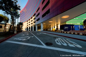
While other prospective tenants remain a mystery, my tour showed me how the building, now nearly complete, measures up to the rumors, dismissals, hype and hope that have surrounded its design. Accompanied by Cohen staffers, I made my way through the Blue and Green buildings and into the motor court of the Red building. It quickly became obvious that approaching the Red building on foot was just not the way to do it. There was no pedestrian entryway. “Good,” I thought to myself. Too many buildings in LA try to shoehorn in a pedestrian entry that never gets used. This is an LA office building, not a store or a café. Almost all visitors will be arriving by car under the prow on San Vicente.
From the valet court, I crossed the driveway and entered the lobby where elevators take people to the sixth floor. Awaiting them there is the “Palm Court,” which slices the two towers apart and is framed by two double-height glass walled lobbies. This is where visitors and employees check in before heading to their final destination.
Construction workers were putting in the finishing touches (cleaning glass, installing light bulbs). It was clear that the building is on the cusp of completion. All that remains is getting the certificate of occupancy from the city, which Cohen’s staffers expected to receive in a week.
The sixth-floor lobby, whose floor is a swirling terrazzo pattern, is lush but not gaudy and includes a nice California touch: What Donald Trump would have paneled in gold instead is wood and there’s lots of it.
The Palm Court still needs many of its plants to grow in but it provides nice views and a good breeze. This is where I would eat lunch if I worked here. The palm trees, despite being six floors up, feel natural. Maybe it’s a California thing, where outdoor spaces seem empty without a palm tree.
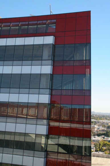
From there I headed to the top floor of the west tower, stepped out into the main space and discovered the building’s main draw — the view. Wrapping each floor is a continuous horizon, one takes in the closeness of the city, looming mountains, slivers of cloud, far off skylines and saturated neighbors while circumnavigating each floor.
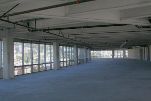
The interior space on the top floor is unselfish. No columns penetrate the long open spaces, and the windows are continuous and nearly all floor to ceiling. The curves will no doubt make for some awkward furniture placement (try putting a square desk against a round wall), but this is a minor issue. The curves actually accentuate the views, creating a pleasant wrapping effect — one will have both a frontal and glancing side view of the outdoors — which mitigates the claustrophobic feeling one gets from the tunnel-like halls of other office buildings this size.
These same curves that soften the interior create bold and varying effects when seen from the street.
After my tour, I walked down Santa Monica Boulevard between La Cienega to Robertson, stopping periodically to view big Red. It is a building that takes on a very different character, depending on the direction and distance from which it is viewed.
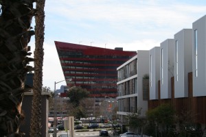
From nearby streets like Huntley or San Vicente, the curved and sliced forms have a monolithic quality. Large, opaque, smooth. Yet from far away, or from within one tower peering at the other, it is highly transparent.
The exterior appears to be a literal curtain, pulled at the two points and draping slightly in the middle, hanging in front of the structure. Even the tops of the elevators and stair wells, which pop up past the facade, add to the effect that the Red is thin, transparent and striated.
The Red building is auspiciously audacious and the fact that it is well constructed, totally corporate and decked out to be top of the line underscores the success of its debauchery. And while its positioning next to its older siblings makes the Red building’s audacity less potent, anywhere else it would be a delicious outrage.
Hawthorne was a bit hasty in 2006. He did not see the ways this building could and should have prompted a reassessment of Pelli’s work. Since Pelli left California for the East Coast at the end of the Seventies, his designs have never matched the kind of bizarre and ostentatious experimentation of his California work. They have always been good, but became increasingly safe.
The Red building is a lot of things, but it is certainly not safe, quiet or unobtrusive. It is an impressive piece of architecture by an old man (Pelli is now 86) returning to youth’s freedoms and follies.
It is a reminder that even the most corporate commissions can still take part in experimental, engaging, innovative and controversial design. All those things that architecture generally and the work of large corporate offices in particular, rarely dare to be.
That is a cause for both a reassessment of Pelli and a celebration of Red.
As a resident in the tri-west area, the character of our neighborhood has been destroyed by this behemoth. The noise and commotion during construction was intolerable, and it towers over the western horizon like a menace. I hope it remains unoccupied and gets demolished. It will always be Moby’s Dick or Ahab’s Revenge to me.
Amazing Design, wow!!!!!
Green is not a primary color.
@ Mr. Heully: Your description of “approaching the Red building on foot was just not the way to do it. There was no pedestrian entryway” This is fascinating feature, particularly in a town that has been dubbed as one of the most “walkable cities” and, that city is pressing hard to get people out of their cars and on to bikes and public transportation. Seems a contradiction for you to describe it as ” kind of neighborly” and then “it is certainly not safe, quiet or unobtrusive” Further, your statement “This is an LA office building” I am sure you… Read more »
The Blue Whale retains that name for a reason. It was joined by the Green Giant and now will have the Red Menace on the site. This review did nothing to change my opinion about the 3 buildings.
Although I appreciate the art behind the buildings, as a NY’r now living in WeHo I find these buildings void of any thought of their surroundings. Instead architecture that compliments and inspires the area (WeHo Library). This building simply looks thrown into a plot of land, and at worst often looks (at some angles) as a monolithic, cold, cruise ship.
I would have liked to see more pictures of the interior, particularly the lobby. And who knew that it still didn’t have a certificate of occupancy? I thought it was done and that it just sat empty because of the high cost per square foot and Mr. Cohen’s reputation for being a bit difficult. The unknown factor here is how badly traffic will be affected by the tenants if/when the Red Building is fully leased and occupied. I hope it’s a boon to our local merchants and restaurants. Also, whatever its assessed value, the City should finally get some property… Read more »