Westime, the high-end Los Angeles area purveyor of timepieces, opened its flagship location on Sunset Boulevard in West Hollywood last month (December 2012).
The result, unfortunately, is more shipwreck than “flagship.”
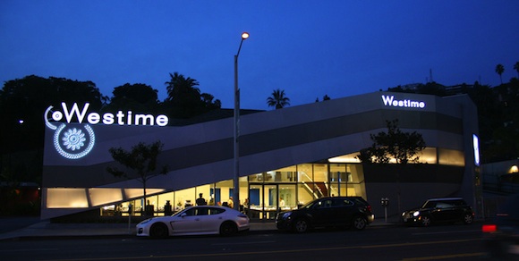
A near total renovation of a Sunset Plaza-style building, this new structure by Wick Architecture and Andrew Lindley of LAND, a retail design firm, features a ribbon-like front of metal panels in two tones, with an additional strip of semi-transparent material that at night is lit from behind.
The entrance gradually raises its upper lip from near ground level to allow passage through a glass wall, before quickly cutting to the ground. The ribbons then turn the corner and abruptly terminate in a stucco tower that was part of the original structure — squared off and flattened to appear more current.
The driveway and parking lot (on the west and back sides of the building) are flat, following the walls of the original structure, which floats in relief atop its site — the pitched roof of which can still be seen from some angles on Sunset. The new design is finished off with the profuse use of the Westime name and gear-like logo, which is displayed, variously, as inset neon-lit letters, a light-box sign and the Westime name marching along the top edge of the building, complete with oversized gears and embedded with neon.
The building looks as if it wants to fit in with the gaudy Sunset Strip, but can’t make up its mind. Does it want to be a contemporary package wrapper, a car dealership, a billboard, a ribbon or a rock?
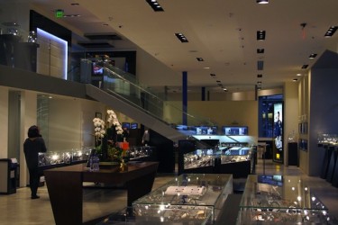
The interior is equally perplexing. A relatively small space, it feels cramped with small nooks, coves, cubbies, offices and makeshift lounges that give the impression multiple stores or departments are within the one building.
As one enters the store and takes a right, walking towards a giant poster of David Beckham, space dividers are covered on one side with what might be a kind of faux leather and on the other with wood veneer. They chop out a series of too-small lounges with leather chairs from the floor plan.
Along the back wall are offices and additional rooms, some with brightly painted blue walls, others with glass covered in the Westime logo that continue this poorly defined sequence of spaces. Relatively elegant display cases disappear, as the whole composition becomes a blur covered in inexplicable finishes and colors.
This cramped quality can also make it downright uncomfortable to navigate.
At 6-feet tall, I thought I was about to hit my head on the ceiling soffit going up the stairs. Judging from the scrapes in the drywall, some taller poor soul already had.
The logic behind the design seems to be, if something can be done, do it. If a stair can kink instead of being straight, kink it. If a column can be colored instead of plain, color it. If a wall can be textured instead of flat, texture it!
In sum, the new Westime suffers from attempting to do too much at once, both inside and out.
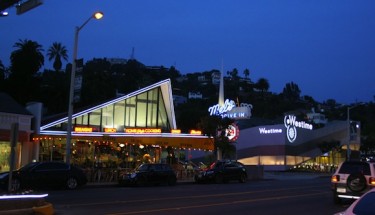
This is really too bad, particularly for a building positioned next to Mel’s Diner, which is a perfect example of Los Angeles Googie architecture, a “space-age” style influenced by 50’s car culture that set the standard for architecture that did too much — by doing it successfully.
Mel’s architecture is intentionally ticky-tack, paper-thin and appliqué, but it succeeds because it doesn’t take itself too seriously. Westime, on the other hand, strives to be a serious and sophisticated piece of architecture — a hard sell when there are giant neon watch gears applied to and projecting past the walls of the building.
All that said, the design does have some merit. The jumbled interior may be nonsensical for the average browser (who is tolerated) but it does provide semi-private retreats in its nooks and crannies for clients who can afford to drop $10,000, $50,000, $100,000 or more on a time piece to be properly pampered. Westime’s real clients do not walk the store (and risk a bump on the head) and do not need to look in the display cases — the pieces are brought to them.
For your average consumer, Westime provides some window-shopping in the land of wealth, but really it caters to a very specific crowd and does this well enough. This would be acceptable if the design were acting only as the frontage of an interior, one in a larger strip of stores, but as a piece of architecture that needs to stand on its own, the design lacks cohesion and does not hold up. Architecture in such a prime location offers a much larger opportunity.
Don’t get me wrong, Westime should not have tried to be more conservative, historical, useful or even beautiful — Mel’s diner is a perfectly responsible, rambunctious and repulsive piece of architecture. Westime could have learned much from its Googie neighbor, which took the trappings of the era’s commercial culture (signs, formal flash, tricks and neon) and turned them into something new, interesting and engaging.
Westime could have found a way to use today’s fascination with bling, brand, celebrity and the faux in much the same way that the designer of Mel’s embraced that era’s crass car commercialism. Instead the designers missed the opportunity to make a statement on contemporary commercial culture and closed themselves out of the possibility of creating an elegant piece of architecture.
They needed to make up their mind.
What does this critic knows about architecture and design?